By The Husted Team
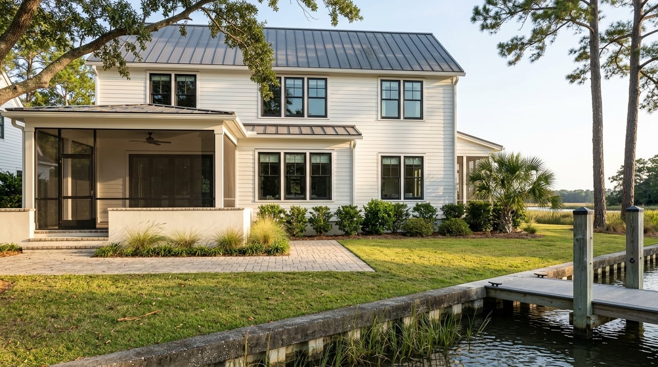
Color shapes how a home feels long before furniture or décor come into play. We work with homeowners in Summerville who are often surprised by how much paint choices influence mood, light, and the overall flow of a space. Choosing the right tones isn’t about following trends or picking favorites in isolation; it’s about understanding how color interacts with architecture, lighting, and daily routines. When color decisions are made thoughtfully, every room feels more cohesive and easier to live in.
Key Takeaways
- Color affects mood, scale, and flow throughout a home
- Lighting and architecture should guide paint decisions
- Consistency matters just as much as individual room choices
Start With Natural Light
Letting light guide your decisions
Light is one of the most important factors in determining how paint will look once it’s on the wall. The same color can appear dramatically different depending on exposure and time of day.
- Rooms with abundant sunlight can handle cooler or deeper tones
- Lower-light spaces often benefit from warmer undertones
- Changing light throughout the day requires balanced shades
In Summerville homes, where sunlight can be strong and humidity influences brightness, observing how light moves through a room before choosing paint helps avoid colors that feel washed out or overly heavy.
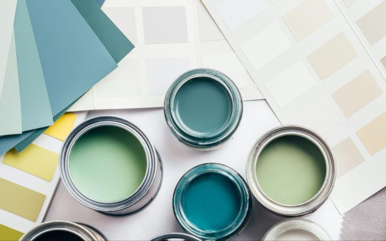
Understand Undertones Before Choosing a Shade
Why undertones matter more than color names
Two paints labeled the same color can look completely different once applied. Undertones are what give a color its true character.
- Warm undertones include beige, yellow, or subtle red notes
- Cool undertones lean toward blue, green, or violet
- Neutral undertones sit comfortably between warm and cool
Undertones become especially noticeable next to flooring, cabinetry, or countertops. Homes with natural materials benefit from undertones that complement rather than compete with those finishes.
Think About Flow Between Rooms
Creating cohesion throughout the home
Color choices should feel intentional from one room to the next. Abrupt changes can disrupt the sense of continuity.
- Choose a primary neutral that appears in multiple spaces
- Use tonal variations rather than completely different colors
- Repeat accent tones subtly to connect rooms
This approach is especially effective in open layouts common in Summerville, where sightlines extend from one room into another.
Match Color Intensity to Room Function
Letting purpose guide the palette
Different rooms serve different purposes, and color should support how each space is used.
- Living areas benefit from balanced, welcoming tones
- Bedrooms often feel best with softer, muted colors
- Workspaces can support slightly deeper or more focused hues
When homeowners ask how to choose colors for a room that actually support daily life, function is often the missing piece.
Don’t Forget Ceilings and Trim
Completing the full color story
Walls are only part of the picture. Ceilings and trim influence how a room feels just as much.
- Lighter ceilings can make rooms feel taller
- Consistent trim color supports visual cohesion
- Subtle contrast adds definition without distraction
In homes with architectural detail, thoughtful trim choices highlight craftsmanship rather than fading into the background.
Test Paint in Real Conditions
Why samples are essential
Paint chips and digital previews can’t replicate real-world conditions. Testing colors in the actual space is critical.
- Apply samples to multiple walls
- Observe color at different times of day
- View samples alongside furnishings and finishes
Summerville’s changing light and climate can influence how colors read, making this step especially important.
Use Accent Colors Strategically
Adding interest without overwhelming
Accent colors work best when they’re intentional and limited.
- Feature walls should highlight architecture
- Deeper tones work well in dining or flex spaces
- Accents should appear elsewhere for balance
Restraint helps accent colors feel layered rather than distracting.
Consider Flooring and Fixed Elements
Working with what won’t change
Paint should complement fixed features rather than fight them.
- Coordinate with flooring tones
- Consider cabinet and countertop colors
- Account for stone, tile, or brick elements
This alignment creates a more polished result and avoids costly repainting later.
Avoid Trend-Driven Decisions
Choosing longevity over novelty
Trends move quickly, but paint choices tend to stay longer than expected.
- Neutral foundations age more gracefully
- Timeless palettes support future flexibility
- Personal taste should still respect the home’s style
Homes that feel current without being trend-heavy tend to hold their appeal longer.
Align Color With Architecture
Respecting the home’s design
Architecture should guide color decisions, not be overridden by them.
- Traditional homes suit classic, layered palettes
- Contemporary homes support cleaner color stories
- Transitional homes balance warmth and simplicity
Summerville’s mix of established neighborhoods and newer construction makes this alignment especially important.
Think About the Emotional Experience
How color shapes daily life
Color influences how a space feels emotionally, not just visually.
- Warm tones encourage comfort and connection
- Cooler tones support calm and focus
- Balanced neutrals provide flexibility
When color choices support emotion as well as function, homes feel easier to live in every day.
FAQs
Should every room be a different color?
Not necessarily. Related tones often create better flow and cohesion.
Do darker colors always make rooms feel smaller?
No. When used thoughtfully, darker tones can add depth and warmth.
Is white always the safest choice?
White can work well, but undertone and lighting matter just as much as shade.
Bringing Color Decisions Together
Paint is one of the most effective tools for shaping a home's appearance and ambiance, but it works best when decisions are made intentionally. We help homeowners understand how to choose colors for a room by considering light, layout, and long-term livability together rather than in isolation. Thoughtful color choices create spaces that feel cohesive, comfortable, and enduring.
If you’re planning updates or refining your home’s interior, reach out to us at The Husted Team to talk through how color choices can support comfort, cohesion, and long-term enjoyment in your Summerville home.